The Wine Cafe
BRAND REFRESH
Mankato’s Wine Cafe needed a branding update. The current visual identity lacks consistency and leads to confusion. In my design, I wanted to keep the cozy and casual feeling of their atmosphere, while adding a bit of sophistication.
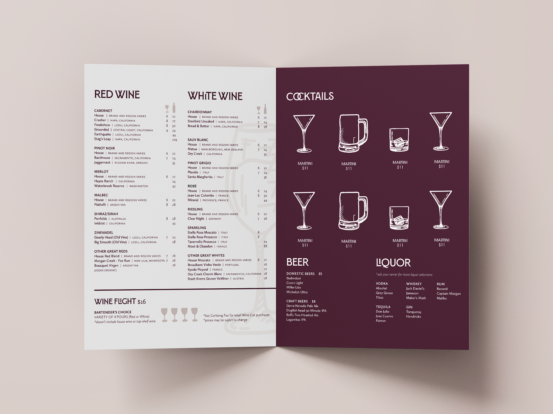
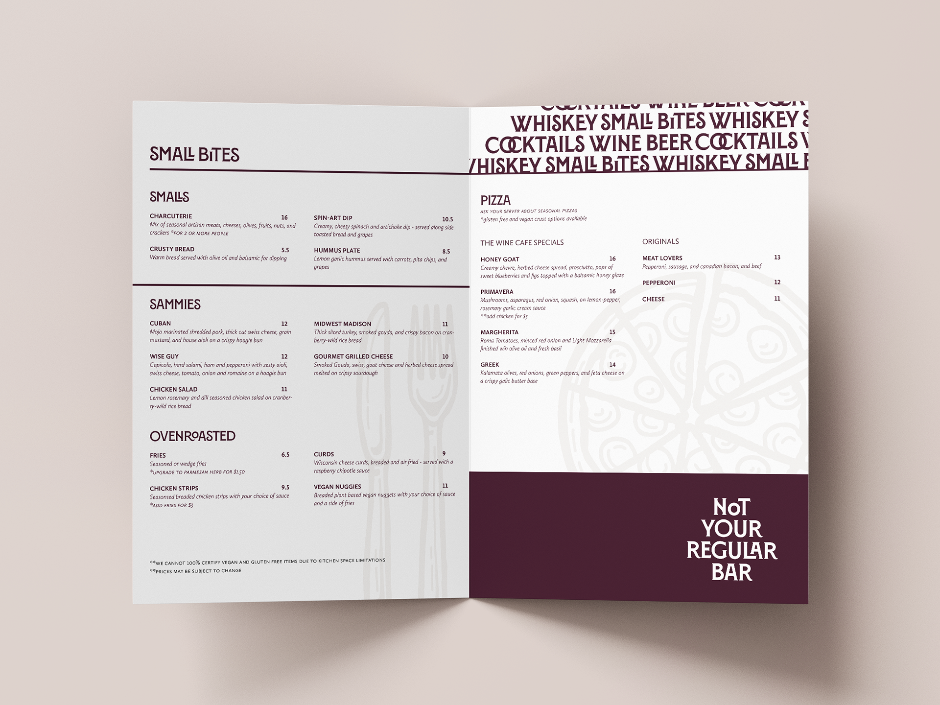
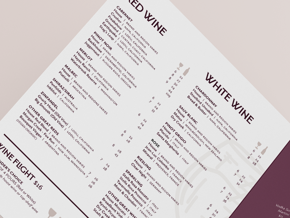
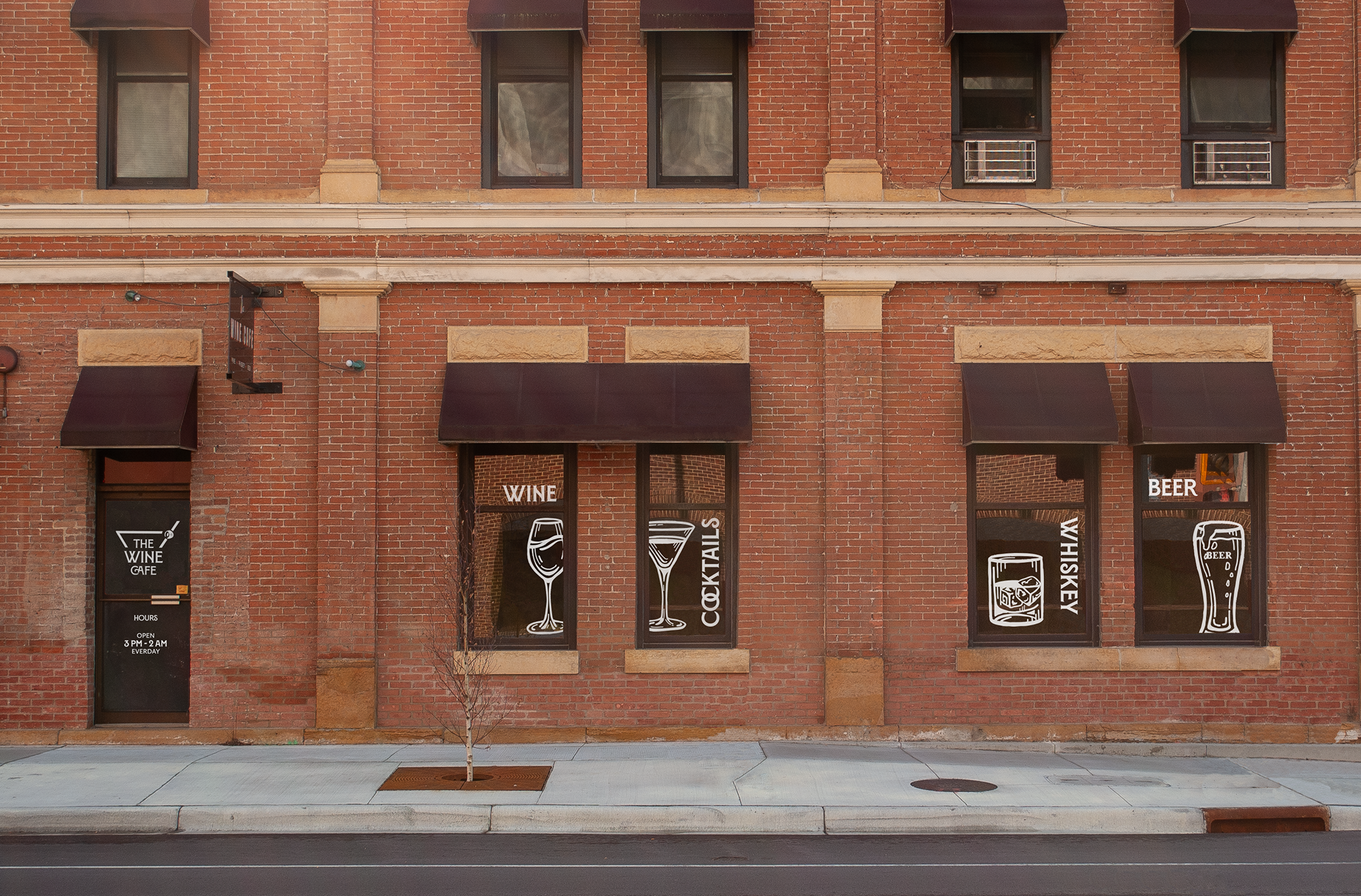
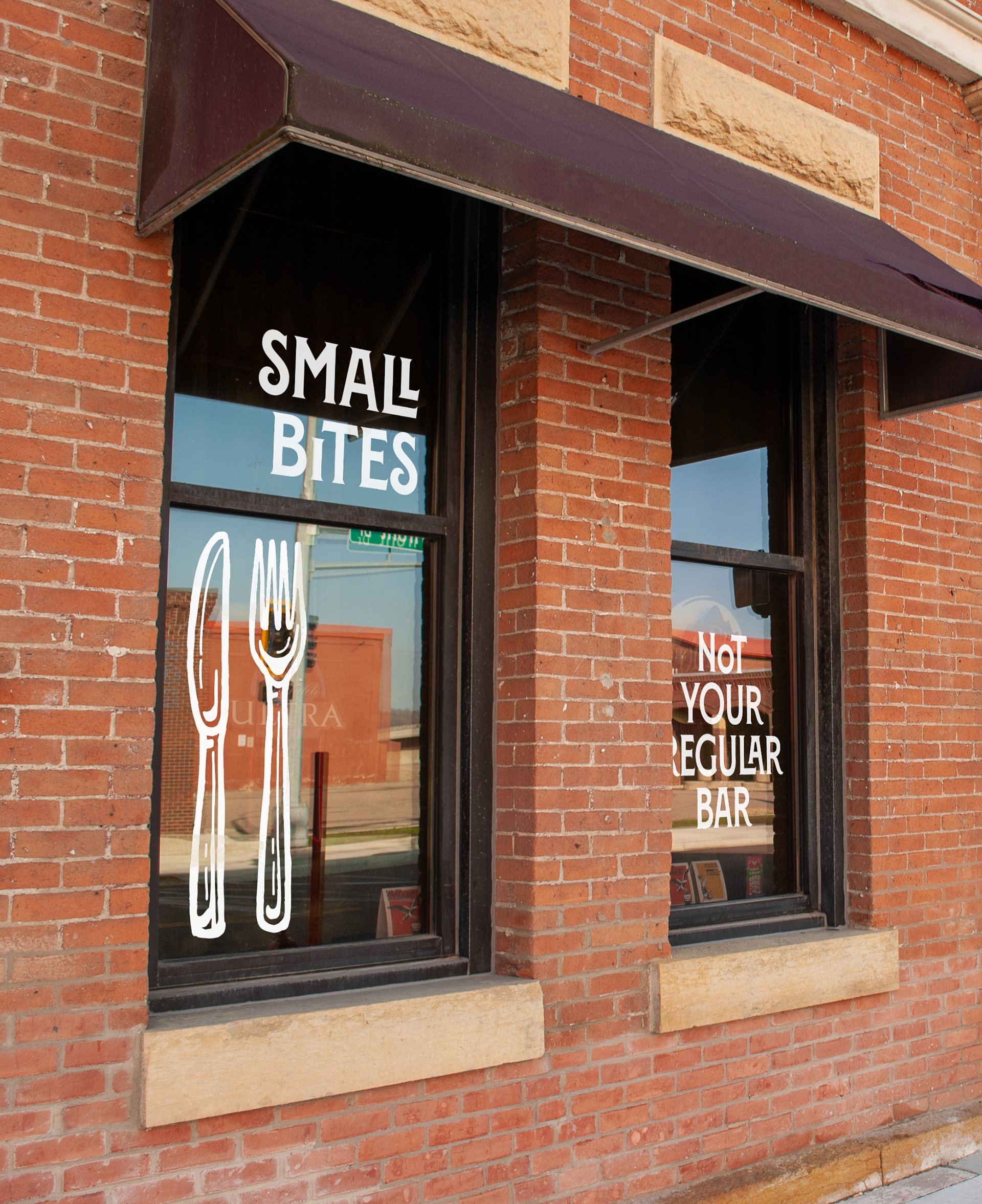
The goal was to create more cohesive branding and establish a solid identity that The Wine Cafe could build off of on all digital platforms and physicalities including their menus and window decals. Before, you wouldn’t know what The Wine Cafe was from the street, but now everyone will want to stop in!

STORY BEHIND THE REBRAND
WHAT IS THE WINE CAFE?
The Wine Cafe is unique. It is a mix of a restaurant, bar, and winery. People choose to go there for a slow night out, to hang out with friends, and drink casually without committing to dinner or having to stand in a crowded,
loud bar.
loud bar.
PROBLEM
The Wine Cafe lacks a consistent visual identity and branding. Their online platforms don’t match each other, or their signage and menus. Only loyal customers know about this bar. If their visual identity was refreshed and consistent, they could have a much larger audience.
BRAND STRATEGY
ATMOSPHERE
The core concept revolves around creating a brand identity that matches the casual atmosphere of The Wine Cafe, while also adding a touch of sophistication to create a cozy charm. It welcomes everyone to relax, and have a glass of wine, while coming and going as they please.
BRAND ATTRIBUTES
The refresh takes the current quirky, weird, cozy vibe and reframes it to feel charming, quaint, warm, and vintage with a touch of local and homemade.
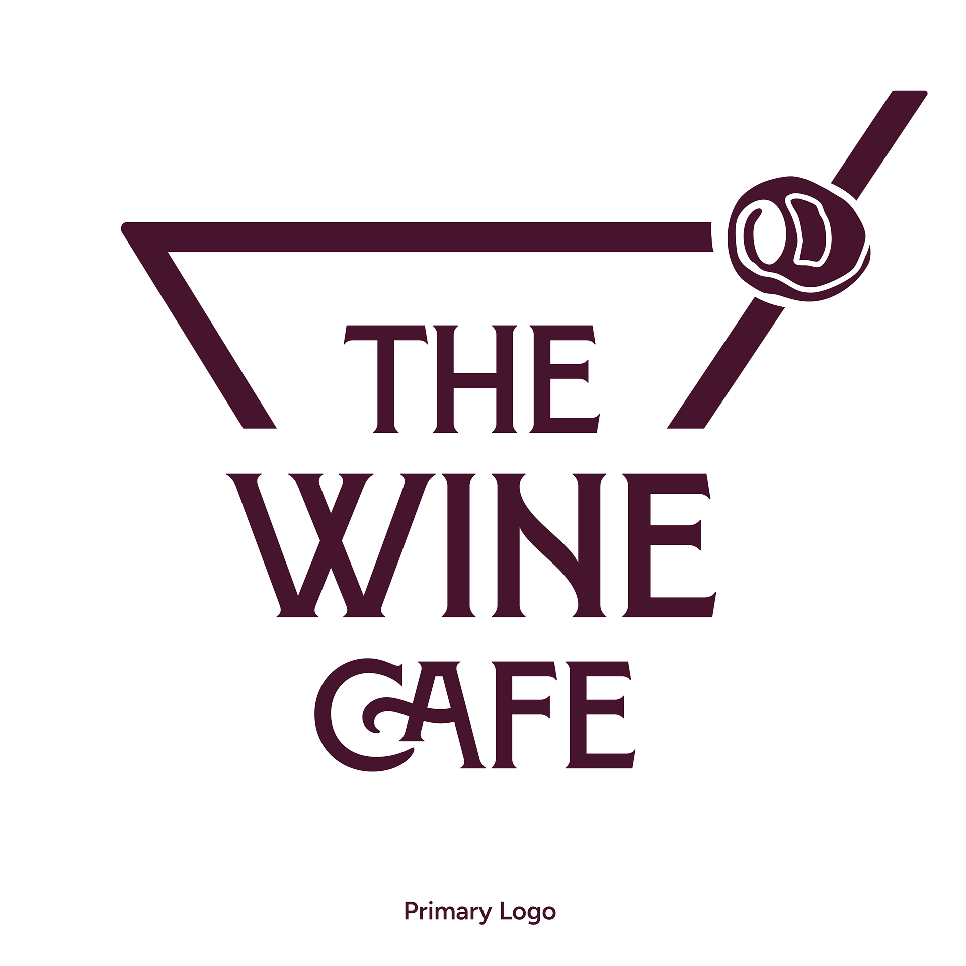
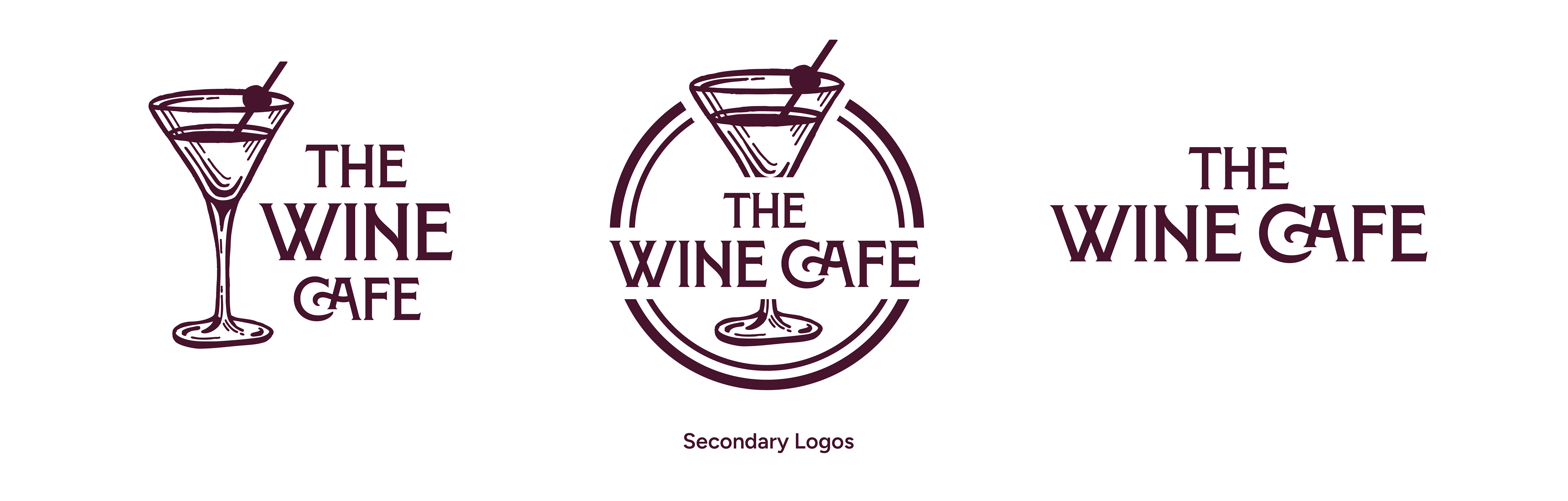
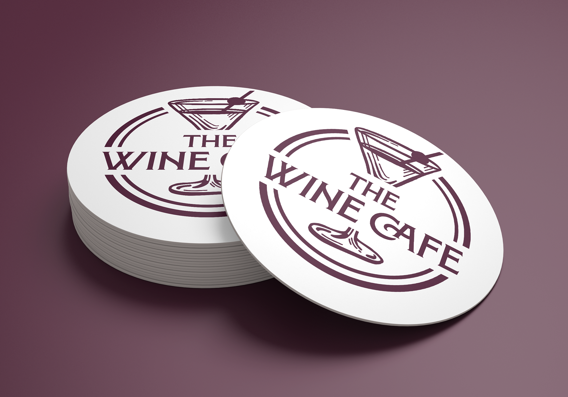
LOGO
Inspiration was taken from the building itself which has a
large martini wire sculpture on the roof. The martini used in the logo represents the variety The Wine Cafe offers to counter the very obvious name.
large martini wire sculpture on the roof. The martini used in the logo represents the variety The Wine Cafe offers to counter the very obvious name.